- Edited
Tips on drawing an image for Spine animation
I drew a quick character, cut him up into little pieces and threw everything into Spine for the first time, just to get a feel for the work process. Setting everything up with bones and images was a breeze, but I quickly realized that the image itself left things to be wanted. I had a lot of "Oh?" moments finding a lot of wierd gaps and overlaps. For example, I forgot to make a proper hip that left ugly gaps in the body/leg when rotated. Won´t do that again. And outlines can cause a lot of trouble.
Realizing that "drawing a character" and "drawing a character to be animated" aren´t exactly the same thing, I was hoping someone more experienced could share some things to think about when drawing the image that´s going to be animated in Spine.
Hi Axeman
I'm baby stepping myself into this new world of animating (I'm a programmer with "some" hand drawing skills). I started animating myself just because of the elegant style of Spine. This software just clicks with me. So of course I tried and testet a lot of things these days and I have found ONE very good rule of thumb when preparing and drawing the model for Spine (for me anyway):
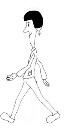
- I don't color or don't shade before I'm happy with the animation.
I draw a character in photoshop with a clear thin black outline and fill it with white and work in layers right away. I Draw over a rough sketch refererence or some other picture in the background.
I found out that (just like you) I had to go back and forth between repairing the images and testing them in spine. With this method It is much easier to see what you need to fix and fixing it is much quicker. You just fix the lines and the white. Shading and colouring just confuses me and I have to swap a lot more between drawing and testing it in Spine.
The good thing about this is that shading and coloring is a joy later when your happy with the animation.
I'm a real beginner and hope you excuse me if this method is too obvious. Thought I should share it since I believe (and hope) there will be a lot of programmers with minimal animation experience (like me) using Spine. It's only 1 of many reasons this program exists....
Unfinished Example:
Loading Image
Tim...
That´s a great tip! I will definitely try that out. It feels like it will save a lot of trial and error time.
Love the animation btw. Looks like "Guybrush Threepwoods lost aristocrat brother". Or something...
That sounds like a good approach. Shiu should weigh in here. SHIU!!!
Axeman: On Guybrush. Well spotted. He's one of my favourite characters.
Nate: Yes, please bring Shiu into this conversation!
I like to add that in my example I use pixelated lines. That's because it fits my project which will have a fixed resolution and pixelated lines. If you're planning to develop a scalable app/game/animation with a smoother look - you may be considering using antialiased lines. But you can always add a blur effect on your lines later.
My example also has a clean sideway perspective. The nice Spineboy "mascot" (wich I guess is made by shiu) use a "fake" perspective - He's walking sideways but showing more of his body. A look I'm eager to adopt (but not for this project) - but a little more tricky when repairing if you're inexperienced.
It is indeed a good tip by Timshark, I'll see if I can give a couple more. These will be focused mainly on how I do it in photoshop
When cutting out pieces don't "cut" from the original layer, make a duplicate of the layer and use a mask instead, then if you need to change the dimensions of your piece, you can just change the mask. This is non-destructive.
If you need to create a different image for a specific animation, export out the frame of the animation from Spine as PNG and use it as a template.
Don't be afraid to make variations of an image if you can't make it look good in animation. The puppet warp tool in Photoshop is often good to use to tweak the contours.
Sketch before you do pretty line art, this is something that can be done really quick, and once you have something you like it's easy to go in and create the pretty version and include color.
Apart from those things, It's really mostly a tweaking process. I am working on a different way of doing all this, not sure if it will be any good yet, but if it is I'll do a video of it. If not I'll do a video of how I've been doing things so far.
Thanks for the tips. I tried out the "sketchy" approach and I must say I liked it. Especially for learning purposes, since inking and coloring takes a lot of time and have little to do with animation anyway.
I made a sketch of a little guy and gave him "elbow" and "knee" protection to cover up some overlapping. That worked out pretty good. Can´t do that for all characters, of course, but I will try and experiment with that and see if it´s possible with plain clothes also. Perhaps it just will be messy, but I will have to get back to you on that one.
I'm no artist but it seems the more outlining you do, the more problems you have with joints. Shiu, maybe there are creative ways to make art that doesn't have problems at the joints?
One of the creative ways is what Axeman described, but it can be a little hard to pull off and wont work for every asset. Thing is it entirely depends on the style you want for your game. For example, a game like Limbo where the character is a silhouette does not suffer from these problems, so coming up with a solution that fits all styles is very hard. Basically the more "contrast" you have in each individual piece, the harder it gets. The easiest way to fix it is to make a few variations of your pieces or create overlapping pieces.
To elaborate on what Axeman already mentioned and what I mean by overlapping pieces. Lets say you have a knee where when the leg is bent a lot the line art protrudes the leg and it starts looking strange, you can then place an image in the center of the knee that does not have line art, just a flat color (or shading that comes very close to the bent knee). This piece will be drawn in front of the upper and lower leg and the line art will get hidden behind it.
Patching over problematic areas is fine, but it's a whole lot easier to animate with art that doesn't have the problem. I have to think there are ways to design art even with contrasting pieces and have it work well with skeletal animation. Check out the warrior, robot, dragon, etc for the Dragon Bones demos:
http://dragonbones.github.com/demo.html
Also, why do they have better demos than us!? :p
There are, there just isn't ONE way of doing it, it all depends on the style you create your art in. Also, stick to coding Nate!
I would say that the Robot and Warrior are both covering up their problem areas in a clever way. They have worked the joints into the character. The robot´s got these circular robot joints in arms and legs, and the warrior has arm and leg protection that conveniently covers up any problem areas. The dragon... Well, it solves the problem by not having joints in legs and arms at all.
I definitely wouldn´t say "better" demos. The first time I saw Spineboy in one of your videos I told my friend "We´ve got to get this!". A poor demo wouldn´t do that. Just saying...
Aye, better in that they show off more of the lib in an interactive way.
Yep, spine boy sold it to me. The dragon is nice and complex, but too much to be on screen that long. Real animation examples will build over time. I will be sharing mine along the way in my new game (well not all lol)